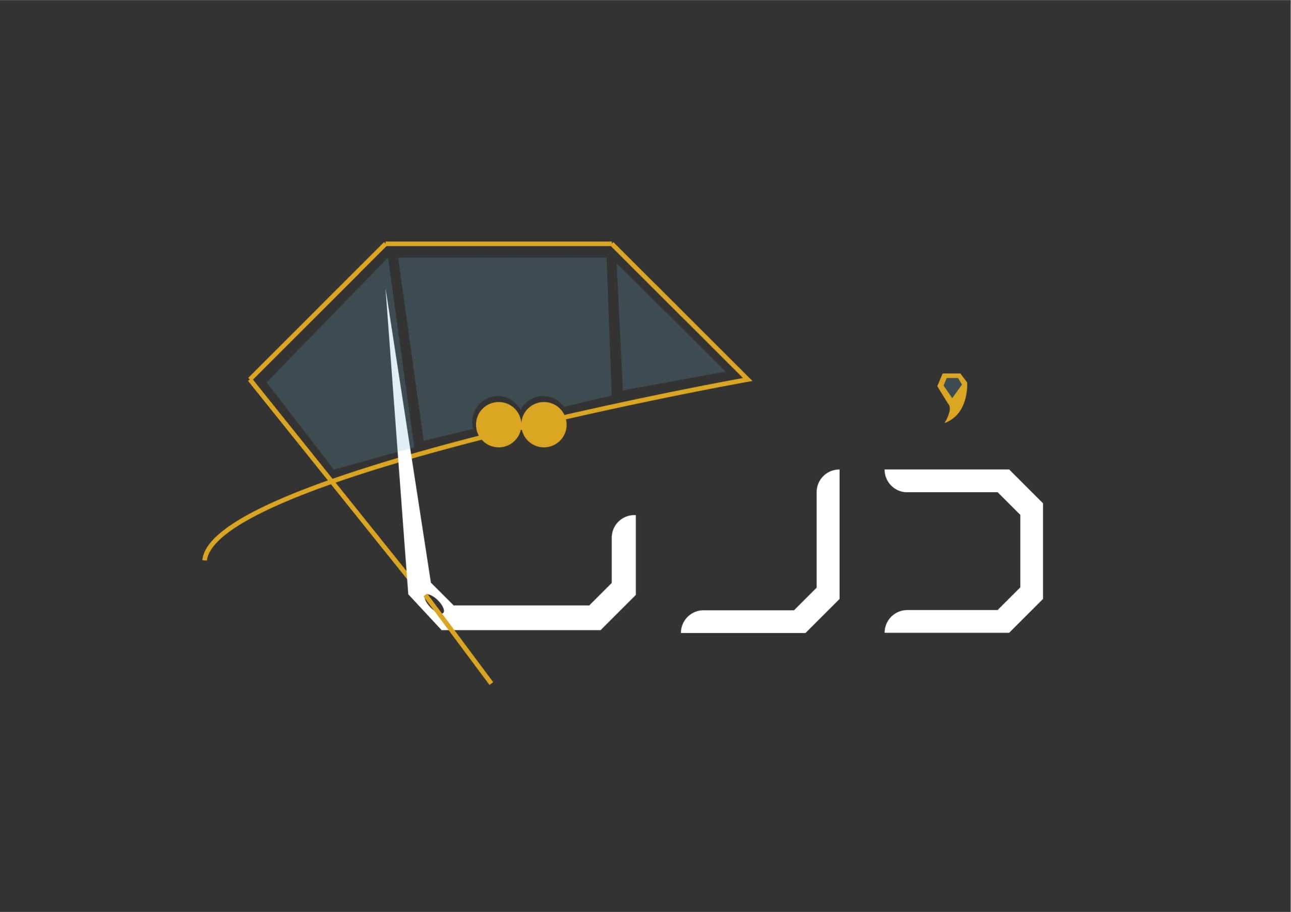
Darta is a jewelry store that aims to distinguish its logo’s appearance and convey the concept of this profession through the logo in the first place
This logo is in the Persian language. The main concepts of this logo, which also have a common aspect, include the last letter of this logo in the form of a needle as a symbol of sewing work in this profession, and the shape of a diamond as a symbol of jewels, which has passed through the needle (last letter) in the form of a thread and ultimately represents a pearl, which also means pearl in the Persian language. The two dots of the letter T are sewn together with the same needle. The combination of these three concepts refers to the process of jewelry embroidery, especially the pearl-like (referring to the scarcity of pearls).